Fantabucks orders are shipping now! Please anticipate shipping delays of around seven days while we catch up on the high volume of orders during our sale.
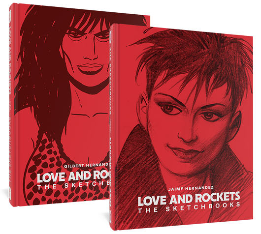
Behind the scenes of The Brothers Hernandez: 400 pages of sketches, inked drawings, early comics, and uninhibited graphic ephemera that never made it into the pages of Love and Rockets.
Both Gilbert and Jaime Hernandez developed their skills as artists in public, in the pages of Love & Rockets, and as quickly as any artists ever have. The first issue showed two promising young tyros; by the fourth, both brothers were clearly among the foremost cartoonists of their generation.
But not all of that development took place on the main stage of their shared magazine. They built up to their 1981 self-published debut with years of experiments, fan art, zine illustrations, early short comics, and gig posters, and continued to work out in personal sketchbooks after establishing themselves as the preeminent cartoonists they became. Fantagraphics published two volumes of this nascent or private drawing in 1989 and 1992; now, a single volume collects the work from these two volumes with a trove of other rarely-seen artwork, for a new generation of admirers.
Gilbert and Jaime Hernandez’s mastery of comics is seen on every page of the thousands of pages of Love and Rockets they’ve drawn over the last 40 years. Here, for the first time in three decades, see the work they put into becoming those artists.