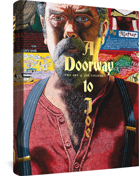
From Shadow to Light: The Life & Art of Mort Meskin is a coffee table art book, biography, and critique of one of the 20th century’s most influential and unjustly neglected Golden Age comic book artists.
Mort Meskin’s comics career spanned almost 30 years, from the 1940s to the 1960s. His drawing, chiaroscuro technique, and storytelling are considered by connoisseurs of the form to be among the most sophisticated of his time — on a par with peers such as Joe Kubert and Steve Ditko. His passion for his drawing was equaled by his skill, and the consistently high quality of his oeuvre in the disreputable comic book format blurs the distinction between high and low art. Yet he is known mostly among hard-core aficionados today, eclipsed in the history books by many of his peers, some of whom he profoundly influenced. Among Meskin’s fans and admirers are Jim Steranko, Alex Toth, Carmine Infantino, and Jack Kirby. From Shadow to Light: The Life and Art of Mort Meskin finally gives this neglected artist the recognition he’s due.
The first artist to draw Sheena of the Jungle, Meskin worked in such diverse genres as romance, crime, and Western comics. Following World War II, he formed a studio with Jerry Robinson. He later worked for Joe Simon and Jack Kirby, and later still with Stan lee at Atlas (Marvel). During the 1950s and ‘60s he helped DC Comics define their mystery and science fiction lines. From Shadow to Light compiles for the first time the best of Meskin’s art from his comic book career, his post-comics advertising career, and his fine art — including many pages reproduced from original art.
“Mort shifted gears/viewpoints/emphasis and methods throughout his career, each on another switch back, sidestep or leap ahead which brought just one more entertaining facet of his talent to the fore. Mort invented, questioned, assessed, discarded, tested, reached out... more than ten other cartoonist of his time — ever searching, finding, losing, winning... ah, but always learning. His restlessness kept him facile... as he learnt, tested, and applied... so did we, his observers and students.” — Alex Toth
“Mort Meskin was a consummate professional, dedicated to his work. A great talent.” — Jack Kirby
“Like so many others, Mort is one of comics’ unsung heroes, but time often has a way of resolving the situation.” — Jim Steranko
“The guy was terrific and had an influence, not only on me but on a hell of a lot of other guys that were in the industry. Carmine Infantino. Alex Toth. All they guys who came into the business at my time knew of Mort and knew of Mort’s stuff and loved it.” — Joe Kubert
“Mort Meskin was a genius.” — Jerry Robinson and Carmine Infantino
Download an EXCLUSIVE 15-page PDF excerpt (5.5 MB).
The cover illustrations are by Charles Burns, as usual, and check out this month's Alvin Buenaventura-edited comics lineup (full details here):
Hot Stuff by Jonathan Bennett Random Access by Charles Burns Anemone and Comics masthead by Lilli Carré Boy’s Club by Matt Furie Eric Gill’s Busy Day by Tom Gauld Giorgio & Dimitrius by Leif Goldberg I Have No Idea by Lisa Hanawalt Race Murdock by Eric Haven Sketchbook by Anders Nilsen Plut by Emelie Östergren Goof Ballz by Andrew Jeffrey Wright
Them's good comics. The issue is also the only place you'll find interviews with both Wallace Shawn and "Weird" Al Yankovic. Order it here and tell 'em we sent ya.
• Reviews: "Both of these books — Blake Bell's Fire and Water: Bill Everett, The Sub-Mariner, and the Birth of Marvel Comics and Steven Brower's From Shadow to Light: The Life and Art of Mort Meskin — do fine jobs of chronicling the artists' lives and careers. [...] The Everett book... is beautifully designed by Adam Grano and as much an art book as biography. Filled with great examples of Everett art — some of which is from the Everett family's own archives — this book opens up a whole new arena for appreciation of this almost lost seminal artist. The Mort Meskin book is fascinating, too. Brower and the Meskin sons do a great job in capturing what the artist was really like, both in his career and his home life. [...] Again, it's an impressive package (something I think Fantagraphics has become famous for) and a welcome addition to any comics fan's library." – Gary Sassaman, Innocent Bystander
• Review: "Four Color Fear: Forgotten Horror Comics of the 1950s is... a cool collection of stories that definitely would have given me nightmares if I read them as a kid. ...Fantagraphics... puts together a wonderful package once again. Some of these stories are almost unreadable, but all of them are enjoyable and strange and wonderful in their own way." – Gary Sassaman, Innocent Bystander
• Review: "The Best American Comics Criticism, edited by Ben Schwartz, is a fascinating collection of assertion, appraisals, debate, reconsiderations, and recollections about comics. This thick, superbly-selected anthology features extremely well informed, exceptional voices... With a fantastically rendered cover by Drew Friedman (spot the critic!), this is a huge assortment of fantastic writing about a field that has had many parallels with and tendrils in rock and pop. If you’re yearning to own a non-music comics book of criticism that isn’t something from the academe yet still creates an alternate world of popular culture magic to teach how to rail and rave and expose and detail, The Best American Comics Criticism is the book to buy." – Chris Estey, The KEXP Blog
• Review: "Fantagraphics always produces beautiful books, but this is one of my favorites they have ever published. [...] A few weeks ago, I carefully slid You’ll Never Know off the shelf. I was ready for it. It was time. It was a deeply emotional read. [...] The art and lettering is stellar in You’ll Never Know, filled with little details that make every page - especially full page panels. [...] You’ll Never Know is excellent example of autobiographical/biographical non-fiction sequential art, and has made my short list of favorite graphic non-fiction..." – Syndicate Product Covert HQ
• Plug: "Norman Pettingill is an underground cartoonist's underground cartoonist. His obsessive linework, his out-of-control hillbilly wonderland — and even his medium — wood, all make for a fascinating experience. And yes, the cover of this book is plywood." – Benn Ray (Atomic Books), Largehearted Boy
• Feature:Seattle Weekly's Brian Miller previews the "Counterculture Comix" exhibit at Bumbershoot and talks to curator Larry Reid
• Coming Attractions: "For me, and I admit I have specialized taste, the best news coming out San Diego was the announcement that Fantagraphics is going to reprinting Floyd Gottfredson’s Mickey Mousecomic strips, which really was during the 1930s one of the great adventure strips. This will be hard for anyone who hasn’t read Gottfredson’s work to believe, but his Mickey Mouse was as rousing as Roy Crane’s Captain Easy and as rich in invention as Barks’ longer Duck stories." – Jeet Heer, Comics Comics
• Commentary:Mike Sterling remarks on pop culture references in the current volume of The Complete Peanuts: "Maybe it’s that Peanuts was just so much of its own little world that the occasional intrusion from outside really stands out."
Snuggle up, 'cause here comes part two in our new column Under the Covers, where we chat with the great Gilbert Hernandez of Love & Rockets about his experience working with musician Kristin Hersh on the cover to the 1996 Throwing Muses album Limbo, and most recently, the cover to Kristin's memoir Rat Girl, out now from Penguin.
[Ed. note: part one of this interview can be found here.]
Inside folded-out CD art for Limbo
Janice: Can you remember all the way back to the first time Kristin approached you to do the album cover for Throwing Muses' Limbo?
Gilbert: I don't remember who contacted me first, or how it actually began. I just go as far back as me in her rented apartment with her husband and her son Ryder, who was just a toddler. And we had Thai food. And I just remember it was a really pleasant experience. I thought she was really down-to-earth, and fun to talk to. It was a really nice, laid-back time.
Janice: Kristin says she was completely prepared to talk you into it, and you were game from the get-go?
Gilbert: Oh, sure. I try to do work like that with people who already have a good reputation, and she already had a strong reputation as a serious artist. I just kinda thought it might be fun. I was also flattered that someone asked me to do an album cover.
Janice: I'm sure it wasn't the first time, right?
Gilbert: It may have been. I'm just not a designer. People always think of me as a writer. Of course, it was grueling. Once I start doing something for somebody else, no matter how simple it is, self-doubt mounts. It turned out fine.
Janice: What was the process like? Did you have any input from the band or the label? Were you just given free reign?
Gilbert: It was pretty much free reign. Kristin just said she liked my Palomar work, so, she wanted something Palomar-esque. I thought, this is great since this is something that I already do! So, I worked something out on that. Of course, once I sent it, I thought, “Oh, this is something they're not going to like,” but she seemed to be okay with it.
CD single from Limbo
Janice: She mentioned you sent a couple of different sketches. The one of the tour bus, which is on the inside of the CD booklet, the girl jumping rope, which was used for the “Ruthie's Knocking” single... [ Ed. note: as I mentioned yesterday, I was wrong -- it was used for the "Freeloader" single. ] Were you surprised that they chose the portrait of the man's face for the cover?
Gilbert: I think that was meant to be the cover. I think she said, the record company wants a bold image. I thought, “Yeah, they're really gonna want this old farmer guy on the cover.” Sure enough, they did!
Janice: So, who is that man? He's an old farmer to you?
Gilbert: He's one of the old folks from the town. Where I grew up, and what I've done in my Palomar stories, is I've always involved older people. They still have a presence in the town and in the characters' lives, because that's how it was for me growing up. It was very integrated. I just decided, y'know, people might be expecting cheesecake from me, so I'll go the opposite.
Janice: So, the expression on his face... How would you describe his emotional state?
Gilbert: Oh jeez, boy. Y'know, I never considered that. I just drew a guy who's seen a lot of life. That's pretty much it.
Janice: When I first bought the album, I was just a teenager, and so I thought he was kinda scary and creepy-looking. And now that I'm older and I look at the album, it's like he actually looks more sad.
Gilbert: What happens to a lot of young people, especially in this country, is they dismiss or goof on old people, because there's only two alternatives to getting old: you get old, just like them, or you die before that. And a lot of people don't want to have to deal with that, so they just kinda categorize old people as frightening or foolish, because they're afraid that's what they're going to become. The alternative is death. I think it's in the back of young people's minds. It's not a daily concern.
Janice: That's interesting. It kind-of lends itself to alternative music or alternative comics. People don't give it the respect that it deserves.
Gilbert: There's so much freedom in it. That's why I've always kind-of stuck to it, and defended doing comics, from a point-of-view of self-expression, 'cause there's so much freedom in that. If you really want to be honest, you have a place for it. If you really want to tell something that has deeper meaning, you can do it.
Janice: That's part of what makes you and Kristin such a perfect fit!
Gilbert: Yeah, I thought it was!
Janice: So, later down the road, when she came to you to do the cover for Rat Girl, there was probably no hesitation.
Gilbert: At first I was a little hesitant, because she was going through a publisher, and... you gotta deal with Art Directors. Let's put it this way, Art Directors at Fantagraphics are a breeze. It's tough, even at small publishing companies, you tend to jump through hoops a lot. And I'm not a very good hoop jumper. I don't take direction very easily. So, I was hesitant at first because of that reason. But for the fact Kristin asked me, and it was her story, I thought, I can't pass that up. Like I said, it's something with meaning. I was happy to jump aboard.
Janice: So, sort of similar, were you given direction, or were you given free-reign?
Gilbert: I think I asked both the Art Director and Kristin what they want on the cover. They said, basically her face on the cover, but as a cartoon. We went through a few stages. A lot of the ones I did were of her smiling, looking at the reader smiling, but it doesn't reflect how she's feeling in a lot parts of the book. So, I did a slapdash of her looking to the side, with a wary look in her eyes. And both the Art Director and Kristin said that's the one, that's the one. And I refined it over and over until it finally came out.
Janice: Kristin mentioned there's a version where she had great luscious lips...
Gilbert: Oh, that's right! I tend to do that when I draw somebody for real. I tend to idealize them a little bit. It's just a habit. A little bit more pert to the nose, a little bit more fullness to the lips, large eyes, y'know. It's just cartooning. And it tends to please people, so I just automatically went that way. And she thought, “Oh, nice drawing, but it's not me!”
Janice: Were you allowed to read the book before you began the art?
Gilbert: I read parts of it. I don't like to read a book, or listen to the music, when I'm working on the thing I'm doing. I just like to have free reign, and have the person describe to me what they like, and come up with something that way. 'Cause I tend to get clogged. If I read the book, then I'm like, “Well, now there's too many ideas.” I can't have too many ideas. If you read the book ahead of time, if you listen to the music ahead of time, then you're like, now I have a bounty of ideas. I have an overactive imagination, so when it's tapped... [ laughing ]. So, I try to close the faucet with that kind-of job, because I tend to complicate things.
Janice: Kristin mentioned one the reasons she wanted a “comic book”-style cover is because the book has lots of imagery in it. So, maybe it's a good thing you didn't read it first. She would've filled your head with all these images!
Gilbert: Exactly. I would've walked away and been like, “Ohh boy...”
Janice: What about the color choices? Was it your idea to have the blue halo effect around her?
Gilbert: No, I think the Art Director came up with that to make it pop. I would've done that anyway, but I didn't know they were doing a black cover.
Janice: It's interesting knowing that the period in her life that she was writing about was such a dark time, so I was wondering, is that reflected in the art?
Gilbert: I think so. You want to grab your audience, and people who might not have looked at it before. They see the words “Rat Girl” and they see this cover and they think, “Oh, what's this?”
Janice: “This is something I could relate to.”
Gilbert: So, that's a good thing. I know from an artist's point-of-view, it's a little awkward, but really it's very important.
Janice: It's so tricky, isn't it, because on one hand, you gotta think about marketing, but on the other hand, you have to take into consideration the artistic integrity of the product. Did you experience that with Limbo?
Gilbert: How so?
Janice: Well, I don't mean this to sound disparaging at all, but did the record label say, “You can't have an elderly person on the cover! That'll never sell!”
Gilbert: I didn't get that, but Kristin might have. You know, I'm trying to think back to it, and I can't remember why I did an old farmer guy. I guess I was just so deeply emerged in Palomar, and I think Kristin really wanted that. Let's make Palomar what it is, and that was one of the things, and she was pleased with that.
Janice: I like the idea of maybe Limbo being a place, like Palomar, where all these characters are residing.
Gilbert: That could work. Another thing is, as much as we want to define what's on the cover, we also wanted to leave it up to projection. For the readers to project. That's so important, especially for young readers. They love to read about themselves. So, if you can grab them with a cover, they see this young woman and think, “That's me!” And then they read it, and say, “Yeah, that's me alright.” So, it's all good.
Janice: Do you feel that's true for your books as well?
Gilbert: I think, yeah, in the early days. Especially with Jaime's work because it's a direct bullet to young people living this lifestyle, and we grabbed on to it right away. It was still relatively new back then in the 80's, starting in the late 70's. We thought it was already over. We were old men doing this. Jaime was all of 21 years old. I was 25 when Palomar came out, whoa. [ laughing ] “I'm gettin' too old for this!” But luckily, we found an audience. Somehow, people wanted to read it.
The exhibition features 3 generations of cartoonists from the city that gave birth and momentum to the alternative comix movement. More than 250 artworks and artifacts are on display, with a comix reading lounge, a continuous screening of David Moore's seminal Hooked on Comix documentary, and cartooning demonstrations by Friends of the Nib and Bureau of Drawers. All Bumbershoot visual art shows are free on Friday, and hizzoner the mayor will tour the exhibitions in the afternoon.
Bumbershoot, Seattle's annual Labor Day weekend arts festival, looks promising this year. In addition to the comix exhibition, there's the daily Flatstock poster show, a special preview of the anxiously-awaited Jesse Bernstein documentary I Am Secretly an Important Man on Saturday, a concert by Hole, featuring the lovely and talented Courtney Love on Sunday, and the equally lovely and talented Tony Millionaire on Monday. Hope to see you there.
One of our most anticipated books of the year is scheduled to hit comic shops this week. Read on to see what comics-blog commentators are saying about our releases this week, click the book links for more info and previews, and contact your local shop to confirm availability.
288-page black & white/color 7.25" x 9.75" hardcover • $24.99 ISBN: 978-1-60699-377-4
"...[T]his much-anticipated 288-page hardcover Fantagraphics collection of assorted short comics by Japanese girls’ comics pioneer Moto Hagio is functionally (if not intentionally) a corrective of sorts. [...] This... is a new gold-hued Hagio for a Golden Age of Reprints in the mighty manga manner..." – Joe McCulloch, Comics Comics (extracted from a full review)
"The class of this week's offering, an engaging selection of stories from a very talented creator. The history, but the stories just work as weird, little stories." [I think there might be some words missing there – Ed.] – Tom Spurgeon, The Comics Reporter
"Let’s go right to the pick of the week, shall we? That would be Moto Hagio’s A Drunken Dream and Other Stories, the first result of the Fantagraphics-Shogakukan team-up that’s being curated by Matt Thorn. It’s a deeply glorious book that brims with Hagio’s psychological and emotional insights." – David Welsh, The Manga Curmudgeon
"It’s a book with a great deal of historic and literary importance, but beyond that, it’s just a great read, and that’s good enough for me." – Brigid Alverson, Robot 6
"...[A] collection of short stories spanning several decades from a true pioneer and a cartoonist who helped shape the shape the face of manga, shojo manga especially." – Chris Mautner, Robot 6
Jim Blanchard brings his Icon Soup art show to fancy-pants pizza joint Snoose Junction Part Dieu here in Seattle. Jim says "I'll have 18 recent paintings on their walls from September 10 through October 7 — Opening night is Friday, Sept 10 at 7 PM, and it should be a cool scene!" More info at Jim's Info Barn blog.
"I will be signing copies of my new book PRISON PIT BOOK 2 at MISHKA in Brooklyn on Friday, Sept. 10th at 7 PM. There will also be original art for sale (CHEAP), dolls, prints and this new shirt that I designed with MISHKA:"
And coming in October:
We've just confirmed the triumphant return of our own Ajax Wood as C.F.! More details on this one are To Be Announced.
Due to an inventory error we have 20 copies of the thought-to-be-sold-out Acme Novelty Library #12 by Chris Ware available to order at the cover price of $4.50! It's a 32-page full color 7.25" x 6" comic book.
[UPDATE: Whoa there, they went fast! All gone now, sorry!]
Who wrote this promo copy? It is magnificent:
Loyal Acme readers who were disgruntled at the previous two issues, in which THINGS ACTUALLY HAPPENED (time shifts, sex, dream sequences, super-heroes, death, maiming, architecture — my God, it was like Bob Dylan going electric all over again) will be delighted to discover that this chapter of the Jimmy Corrigan saga returns to the mind-numbingly claustrophobic eventlessness that distinguished earlier issues (such as the acclaimed, award-losing "32-pages-all-in-one-room" #9). In this issue Jimmy and his dad have lunch! In a diner! For the whole issue! Except in one sequence they walk outside! To talk to an old guy! Then they go back to his dad's apartment! Trust us, after you read this little gem, My Dinner with Andre will look like The Road Warrior by comparison.
Register and Login to receive full member benefits, including members-only special offers, commenting privileges on Flog! The Fantagraphics Blog, newsletters and special announcements via email, and stuff we haven't even thought of yet. Membership is free and spam-free, so Sign Up Today!